Brand Systems · 2025
OB.COT
A menswear identity built on restraint, proportion, and materiality. A complete identity system designed to endure beyond trends.
Client
Alejandro
Year
2025
Role
Independent Brand Designer
Industry
Menswear
Duration
12 Weeks
Status
Delivered
Delivered
Brand Identity, Logo Design, Visual System, Brand Guidelines
[ 01 // Context & challenge ]
Alejandro arrived with a clear idea for a menswear brand: references, a moodboard, and strong taste. What was missing was a visual language that could carry that clarity consistently, from a garment tag to a billboard.
[ 02 // The idea ]
Uncover rather than reinvent. Restraint, proportion, and materiality as the identity's argument, with a palette of navy, red, and cream doing all the talking.
[ 03 // The system in use ]
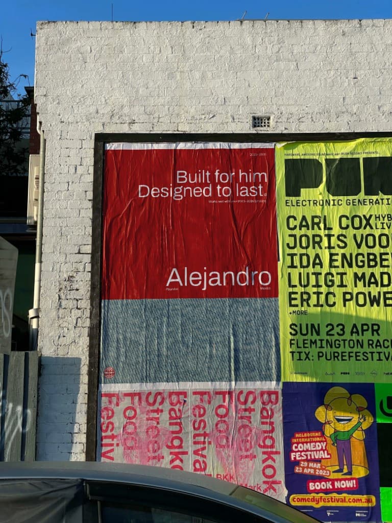
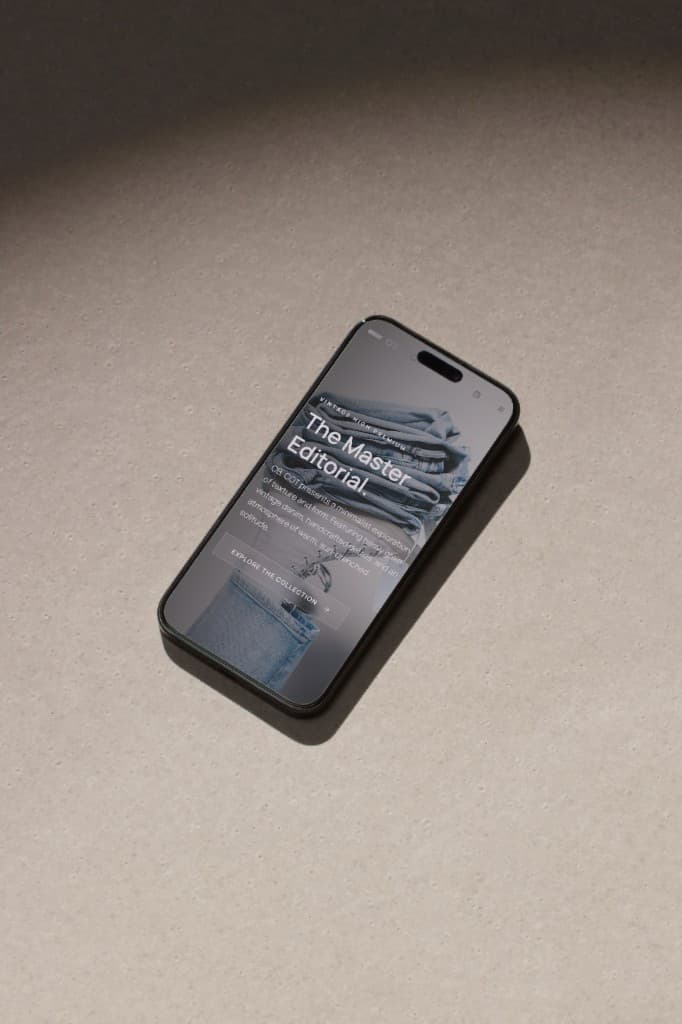
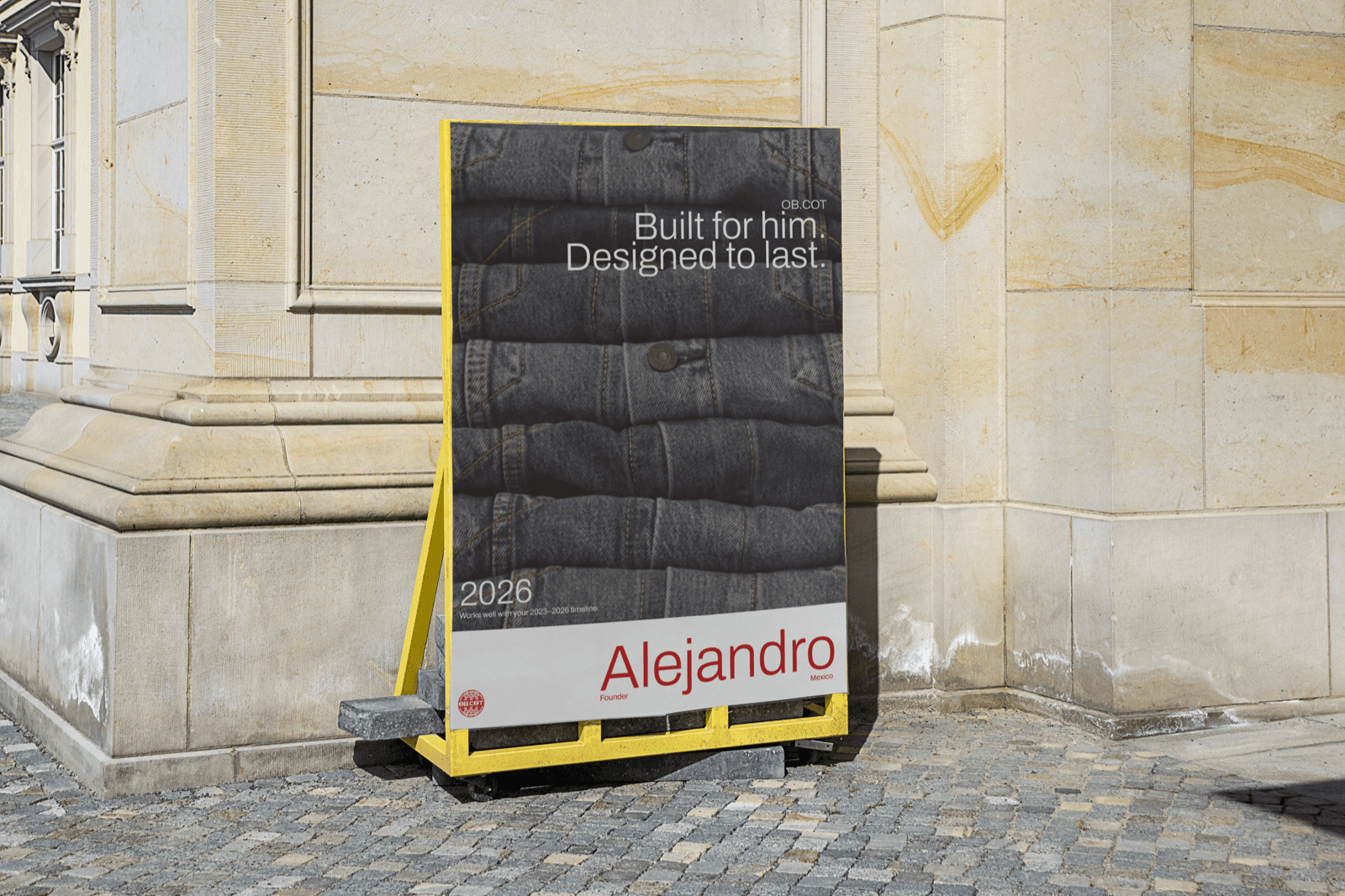
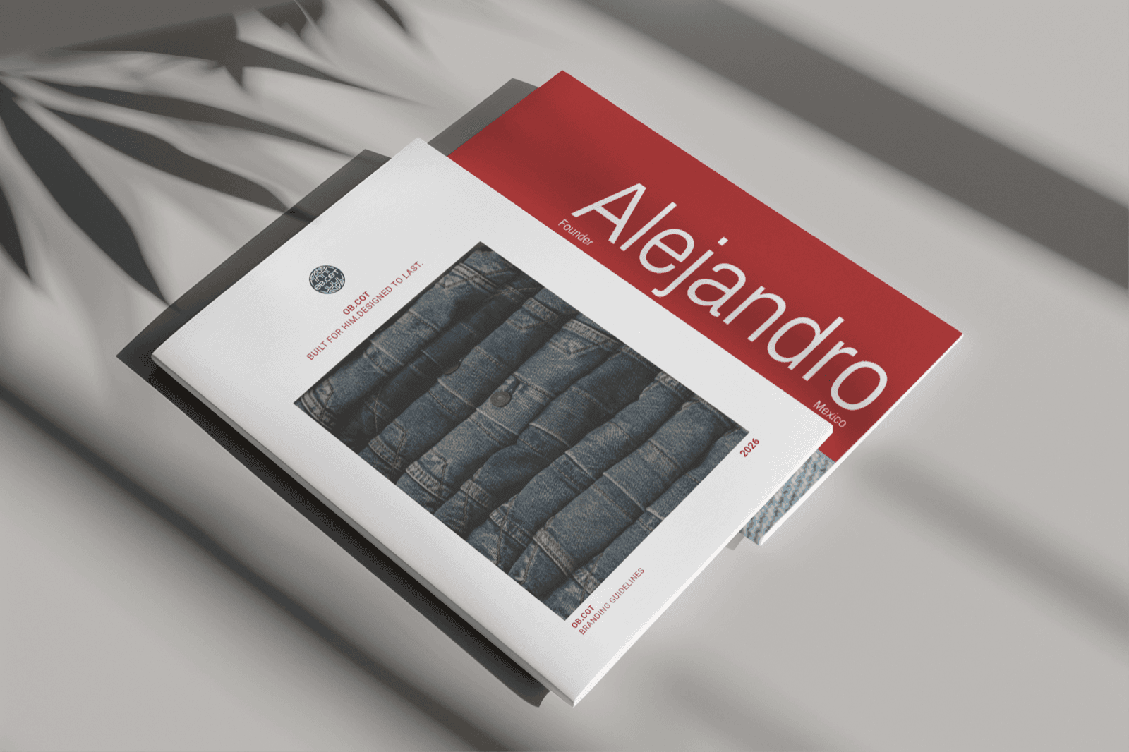
Logo system and seal, typography, colour palette, and brand guidelines built as a deliverable in their own right.


[ 04 // The outcome ]
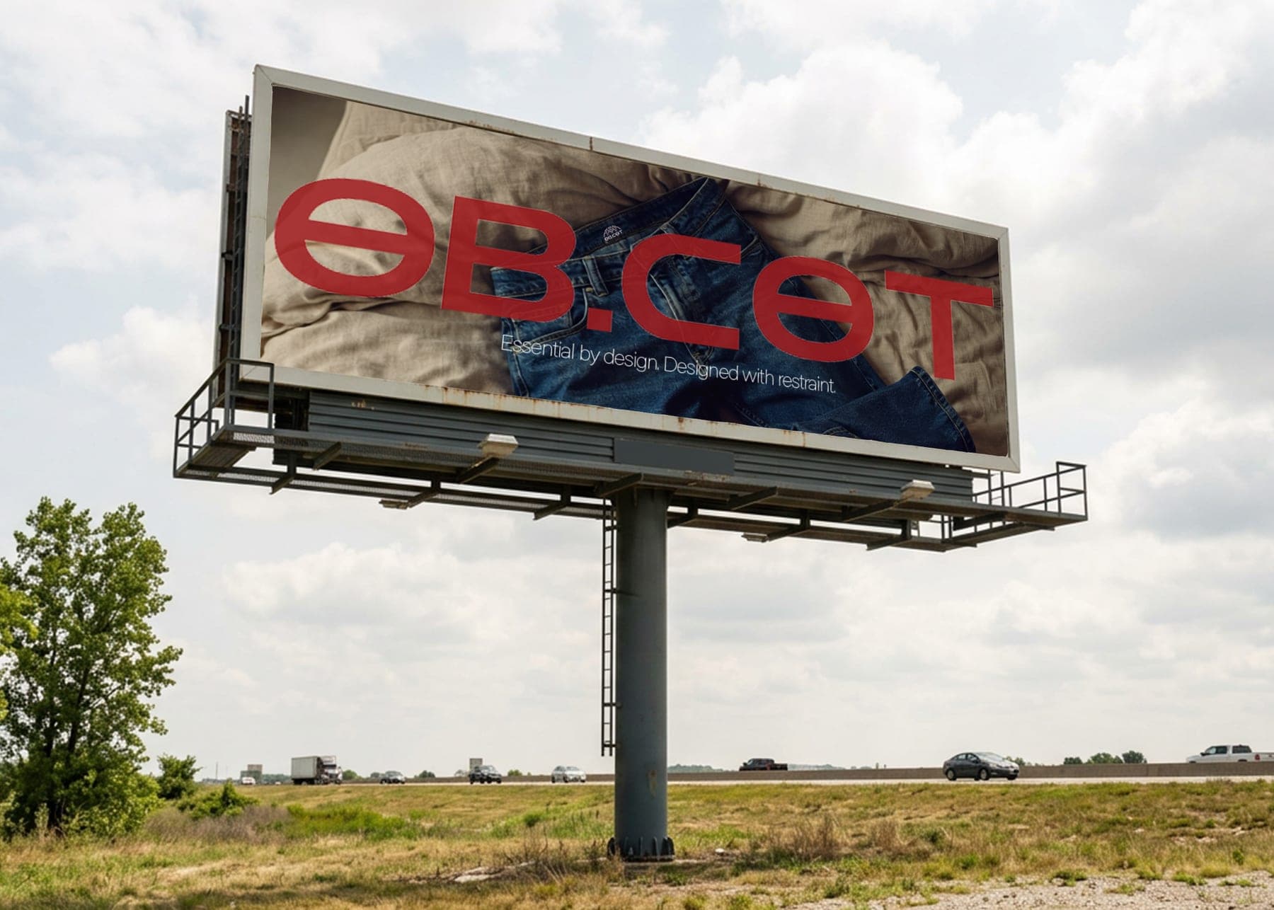
A complete identity delivered in twelve weeks, with a brand book that carries OB.COT from embroidery scale to highway scale.
01
A mark that earns its stamp
The seal and wordmark hold up at embroidery scale and at highway scale.
02
A palette of restraint
Navy, red, and cream do all the talking; nothing decorative survives the system.
03
Guidelines as a product
The brand book was designed as a deliverable in its own right, not an afterthought.
Built to age gracefully rather than chase trends. The truest compliment for this system will be how little it needs changing in five years.
You have the idea. Let's make it real.
Thirty minutes, free, no pitch. Tell me what you're building and where to begin.