SOFTNESS IN DESIGN
Why I choose minimal palettes and soft motion. Interfaces that feel calm and honest.
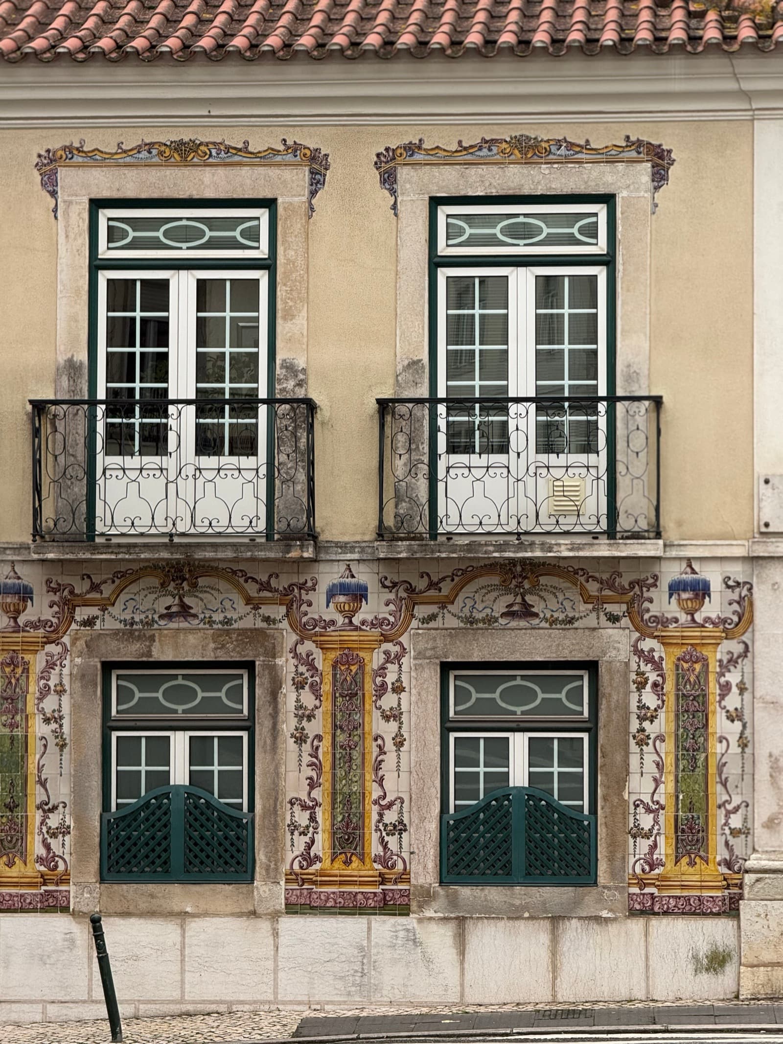
When I arrived in Portugal, I began to notice softness in unexpected places. In tiled walls, layered patterns, and dense compositions that might appear cluttered at first glance, there was still restraint, rhythm, and care. The details were deliberate. Even complexity felt calm.
That observation reshaped how I think about softness in design. It is not the absence of structure or information. It is the presence of balance. Softness can exist within pattern, repetition, and density when spacing, color, and proportion are handled with intention.
Visually, this translates into gentle transitions, controlled contrast, and considered white space. Motion remains quiet. Geometry stays subtle. Nothing competes for attention, yet everything has a place.
Good design does not need to announce itself. It earns trust through consistency, restraint, and care.